Kelly Fincham
 In a world increasingly driven by data, the ability to understand, interpret, and present information is no longer confined to the realms of science and business. It is an essential skill for everyone, including those in the arts.
Understanding data is not about turning into a computer scientist! Instead, it’s about empowering you, the creative and inquisitive mind, with the tools and knowledge to harness the power of data. Whether you want to be an investigative journalist, a writer or activist or advocate or any other kind of knowledge professional, you’ll find that data can enrich your work in ways you never imagined. For aspiring journalists and media professionals, effectively communicating insights uncovered in data is an essential skill. Becoming familiar with data-driven storytelling will allow you to produce more engaging, informative, and impactful stories.
However, it’s not enough to simply uncover insightful trends in data. If you want to drive change, those insights need to be clearly communicated through engaging storytelling that goes beyond just informing audiences. Without proper communication, the changes suggested by data insights will likely face resistance or be dismissed entirely. Data storytelling provides the vital solution. By combining factual data with compelling narrative and vivid visuals, data stories can break through deeply ingrained mindsets and compel action in a way that dry statistics alone rarely accomplish.
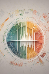
Data, narratives and visuals
The data forms the foundation, providing credibility and specificity. The narrative structure organizes the insight into a memorable storyline that connects emotionally. And the visuals create scenes that drive home the meaning and impact of the insight. Together, these elements of data, narrative and visuals can make insights understandable, convincing and unforgettable, leading to real change. In our data-saturated world, data storytelling represents the future of effective communication.
Excel/Google Sheets
The building block to understanding data begins in familiar territory: Microsoft Excel and Google Sheets. These are tools you’ve likely encountered before but may not have explored deeply. We’ll start by building a solid foundation in Excel, helping you mine the data for insights and focusing on skills that are directly relevant to effective data storytelling.
Finding the story in the data
Visualising data through charts and graphs is important, but not sufficient. Facts and figures alone rarely inspire action. Numbers need a storyline. Whether you’re investigating a controversy, profiling a community issue, or reporting on a complex policy debate, you still need to find and tell the story that can break through the noise. Your audience will be more informed, enlightened and moved to act. In a crowded media landscape, data storytelling can help connect and engage audiences.
Design, communication and critical literacy
We’ll also be emphasising the principles of good design, clear communication and critical data literacy. Data visualisation is not just about presenting numbers; it’s about telling stories and making complex information accessible and engaging and also about understanding and avoiding bias.
Visualisation tools
We will work with simple tools like Google My Maps and Excel charts and then transition to more specialised platforms like Datawrapper and Flourish industry-standard third-party tools which allow for more sophisticated visualisations.
Effective storytelling
By the end of this journey, you will be more than just data literate; you will be able to use data as a medium for effective storytelling. You’ll have the skills to transform raw numbers into meaningful stories.
