5 Machine Learning: Clustering
Introduction
Machine Learning is a technique which enables computers to learn from data, without being explicitly programmed. Machine learning is becoming a big part of our everyday lives, and you might not even realize it!
Here are some examples of machine learning seen every day:
- Facebook tailors your news feed based on the data from posts you’ve liked in the past.
- Netflix recommends videos based on data from your watch history.
- Apple iPhones recognize your friends’ faces based on the data from your camera roll.
Note that in all of these cases, the decision made by the machine learning algorithm is based on what has been learned from the input data.
- Facebook learns the kind of content you like to see.
- Netflix learns what kind of movies you’re into.
- iPhones learn what your friend’s faces look like.
Clustering
Leaving Certificate Syllabus
This chapter is complimentary to:
- Leaving Certificate Computer science, strand 1: Computers and Society.
- Leaving Certificate Mathematics, strand 4: Algebra.
Toy Dataset
Firstly we will use a toy dataset so you can identify patterns by eye before applying the principles to a larger dataset where patterns are not as obvious.
This dataset contains the expression levels of 3 genes for 4 patients:
| IRX4 | OCT4 | PAX6 | |
| patient1 | 11 | 10 | 1 |
| patient2 | 13 | 13 | 3 |
| patient3 | 2 | 4 | 10 |
| patient4 | 1 | 3 | 9 |
Please copy and paste the code below to analyse the data in R Studio Cloud:
df <- data.frame(IRX4=c(11,13,2,1),
              OCT4=c(10,13,4,3 ),
              PAX6=c(1 ,3 ,10,9),
              row.names=c("patient1",
                          "patient2",
                          "patient3",
                          "patient4"))
Visualise Toy Dataset
We will begin by making a barplot of the gene expression data. You will need to use the 'ggpubr' package.
Firstly we need to reformat the data (do not worry about this) but you should recognise the facet.by parameter in ggpubr to produce plots for each patient:
library(ggpubr)

df2 <- tidyr::gather(cbind(patient=rownames(df),df), key= "gene", value= "expression", IRX4, PAX6, OCT4)

ggbarplot(df2, x="gene", y="expression", fill="patient", facet.by = "patient")
Hopefully, it is obvious from the barplot that both Patient 1 and Patient 2 share similar gene expression profiles – that is to say they have similar features – whilst Patient 3 and Patient 4 exhibit inverse gene expression patterns when compared to Patient 1 and Patient 2.
We can see this by eye, but if there were hundreds of patients, with expression data for hundreds of genes it would not be so easy. That’s where machine learning comes in to recognize patterns that we cannot see.
ScatterPlotMatrix
Recall we used scatterplots to assess relationships between two variables. Scatter plots that have been coloured by groupings can also tell us which variables are good at delineating samples.
Manually plotting each combination of variables in a dataframe is tedious, we can use a ScatterPlotMatrix to do this automatically:
# Telling R that each patient ID is a unique name
id <- as.factor(rownames(df))

# Base R plotting
pairs(df, col=id, lower.panel = NULL, cex = 2, pch = 20)
par(xpd = TRUE)
legend(x = 0.05, y = 0.4, cex = 1, legend = id, fill = id)
Distance Metrics
The human eye is extremely efficient at recognising patterns in plots, which we have demonstrated using barplots and scatter plots. But how does a computer ‘see’ these patterns? It does not have eyes so it must use a different method to define how similar (or dissimilar) samples are.
We will use the Manhattan Distance to compute sample similarity mathematically:
Using patient 1 and patient 2 from our toy dataset, let’s work the solution by hand:
Patient 1 vector (x): 11, 10, 1
Patient 2 vector (y): 13, 13, 3

Formula: sum|((X1 - Y1)) , (X2 - Y2), (X3 - Y2))|

Fill in: sum|((11 - 13), (10 - 13), (1 - 3))|

Solve: sum|-2, -3, -2 |

Solve: sum(2, 3, 2)

Answer: Manhattan Distance( Patient 1, Patient 2) = 7
Dist() function
Solving the distance metrics by hand is a useful exercise to understand how distance metrics are generated, but would take much too long in the case of large datasets.
To automate this, use the dist() function in R. Pass the dataframe (which must only contain numerics) and select the distance metric you want to use (in this case we are using ‘manhattan’):
dist(df, method="manhattan", diag=TRUE, upper=TRUE)
#          patient1 patient2 patient3 patient4
## patient1        0        7       24       25
## patient2        7        0       27       28
## patient3       24       27        0        3
## patient4       25       28        3        0
Notice the zeros on the diagonal, this is because there is zero distance between patient1 and itself, patient2 and itself… etc.
Sample Heatmaps
The table of results generated from the dist() function are tedious to interpret – instead, we can use data visualisations to quickly convey this information.
# Load library for heatmaps
library(pheatmap)

# use Manhattan distance (store in matrix)
d <- as.matrix(dist(df, method="manhattan"))

# add patient ID to rows & columns for the heatmap
rownames(d) <- rownames(df)
colnames(d) <- rownames(df)

pheatmap(d, cluster_rows = F, cluster_cols = F,
         show_rownames = T, show_colnames = T, display_numbers = TRUE)
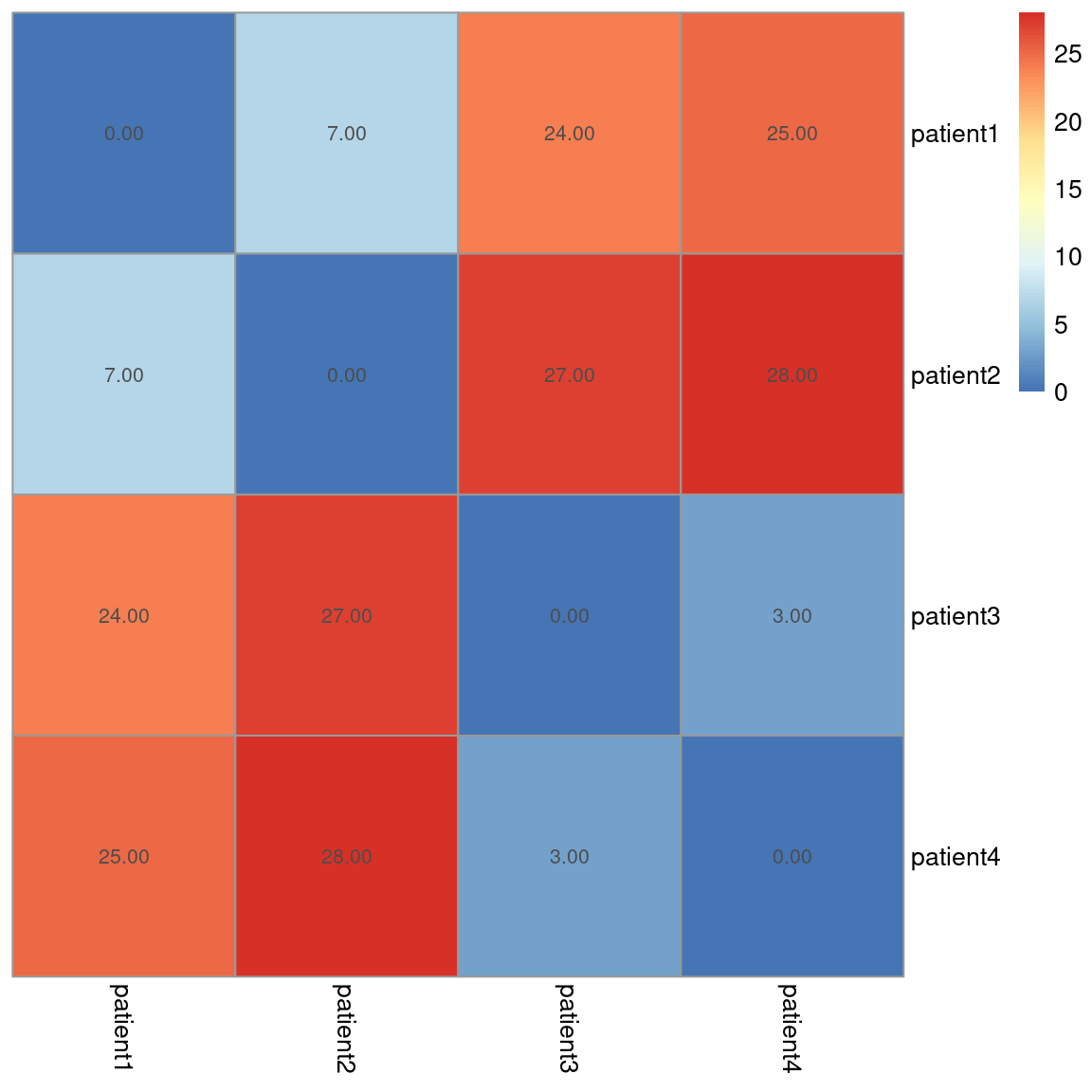
We can see the results for each sample comparison and once again, visually, we can see clusters (groups) forming. High values (red) represent dissimilarity. Here, we can see that patient 1 and 2 are similar to each other, but different from patients 3 and 4, and vice versa.
The next step is to perform clustering via computational methods.
Hierarchical Clustering
The hierarchical clustering algorithm works by:
- Calculating the distance between all samples.
- Join the two ‘closest’ (smallest distance metric) samples together to form the first cluster.
- Re-calculate distances between all samples (and the new cluster) and repeat the process until every sample has been added to a cluster.
Watch the animation below to see how hierarchical clustering works:

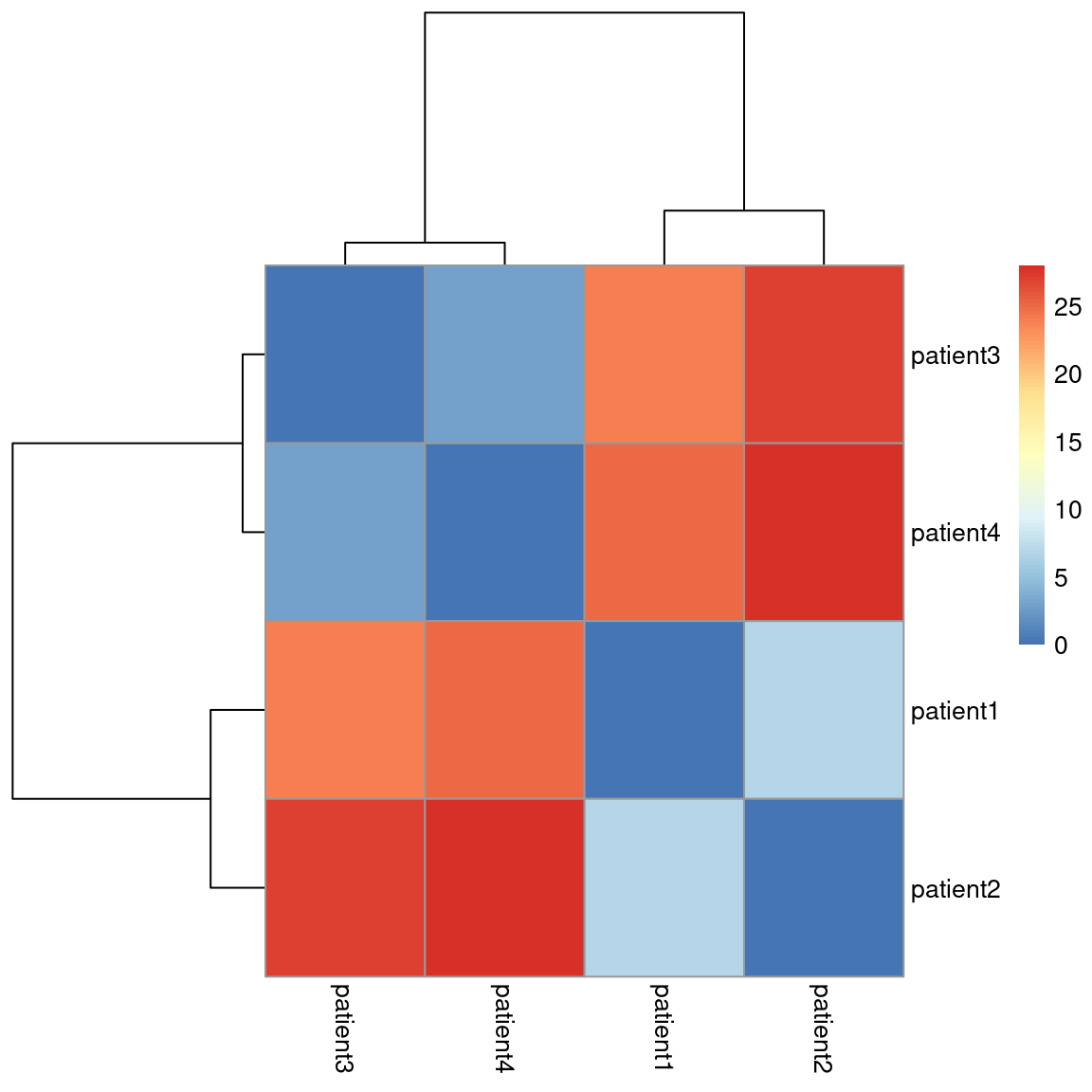
How can we portray this GIF in a static plot? By using a dendogram which looks like a tree with branches. Each branch represents a cluster, until you work all the way down to the bottom in which case each branch represents a sample:

We will add a dendrogram to our toy dataset heatmap to define clusters:
# Plot the distance matrix using a heatmap
pheatmap(d, cluster_rows = T, cluster_cols = T,
         show_rownames = T, show_colnames = T,
         treeheight_row = 100, treeheight_col = 100)
Feature heatmaps
Sample heatmaps are used to assess sample heterogeneity. Feature heatmaps are representations of the values present in each of the variables in the dataset for each sample.
Using feature heatmaps in conjunction with clustering, we can identify the underlying variables (genes) that differentiate samples.
You do not need to compute any distance metric here, simply pass the numeric dataframe to the pheatmap function:
# rotate the dataframe to make plot easier to interpret.
df_t <- as.data.frame(t(df))

pheatmap(df_t, cluster_cols = TRUE,
         cluster_rows = TRUE,
         treeheight_row = 100,
         treeheight_col = 100,
         display_numbers = TRUE)