4 Visualizing Variables
Introduction
In this section, we will cover plots that can be used to describe the distribution of variables in our dataset and in the case of scatter plots, assess if there is a relationship between two variables.
There are many types of variables. Understanding the different variable types is half of the battle when it comes to data visualisation.
Continuous Vs. Categorical Variables
- Continuous Variables – These are numeric variables which have an infinite number of values between two values. Take for example the height of each student in your school, which can take on any number between the shortest and tallest student in the school. The term ‘infinite number of values’ simply means we can record someone’s height as being 163cm, 163.3cm, 163.35cm and so on – a theoretically infinite set of numbers after the decimal, based on how precise our measuring equipment is.
- Categorical Variables – These are variables which can only take one of a limited number of possible values, and can be used to assign observations to a particular group or category. In a secondary school labelling each junior cert student according to their year can only take on values of 1st year, 2nd year or 3rd year.
Visualising Distributions
For this section, we will continue to use the Iris dataset from the previous section:
Go to RStudio Cloud and open your session. Load in the
Irisdataset:iris <- datasets::irisYou can see a newly created Data object in your environment called
iriswith150 obs of 5 variables.
There are two common methods to visualise the distribution of a single variable: using boxplots or histograms – both portray the same information.
hist() or boxplot() function:
boxplot(iris$Sepal.Width, horizontal = TRUE)
plot(density(iris$Sepal.Width))
hist(iris$Sepal.Width)

Boxplots
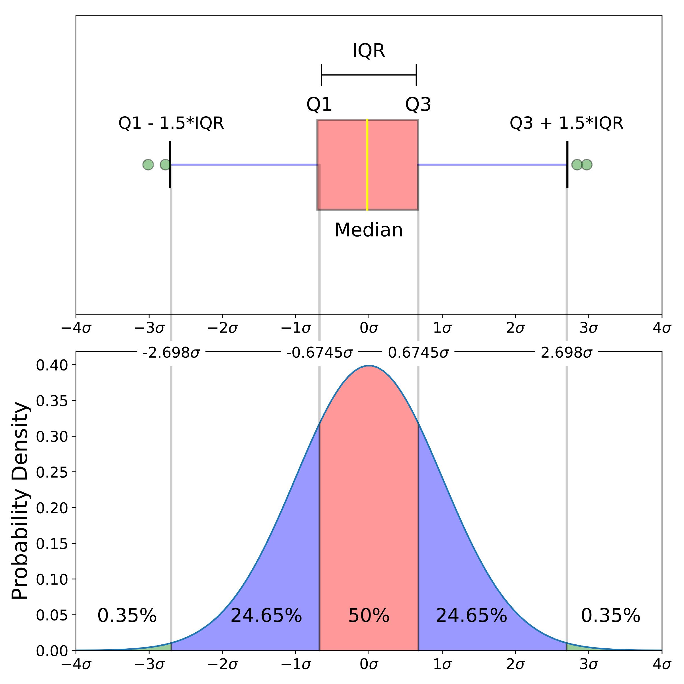
This section will focus on boxplots. Whilst they broadly convey the same information as histograms (the distribution of the data), boxplots are a more informative plot providing the user with a five-number summary of a set of data: 1) the minimum score 2) first (lower) quartile 3) median 4) third (upper) quartile and 5) maximum score.
- Minimum Score: The lowest score, excluding outliers (shown at the end of the left whisker).
- Lower Quartile: Twenty-five percent of scores fall below the lower quartile value (also known as the first quartile).
- Median: The median marks the mid-point of the data and is shown by the yellow line that divides the box into two parts (sometimes known as the second quartile). Half the scores are greater than or equal to this value and half are less.
- Upper Quartile: Seventy-five percent of the scores fall below the upper quartile value (also known as the third quartile). Thus, 25% of data are above this value.
- Maximum Score: The highest score, excluding outliers (shown at the end of the right whisker).
An outlier is an observation that is numerically distant from the rest of the data, and are represented as dots that fall outside of the range of the boxplot whiskers.
Visualising Relationships
To assess the relationship between two continuous variables, use a scatterplot. Simple pass the two variables to the plot() function which accepts as inputs vectors to plot x and y coordinates.
plot(iris$Petal.Length, iris$Petal.Width)
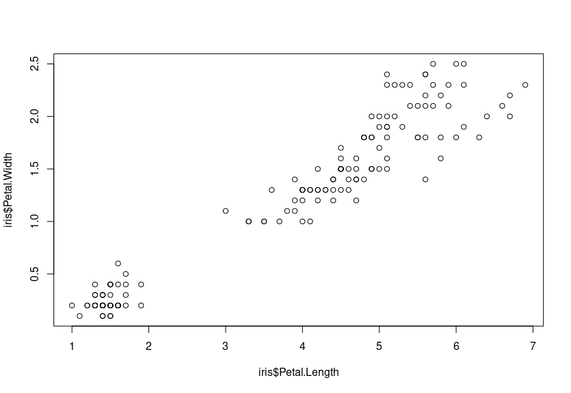
We can see that there is a positive relationship between the two variables – that is to say, as Petal.Width increases, so does Petal.Length. They have a positive correlation.
Visualising Nested Groups
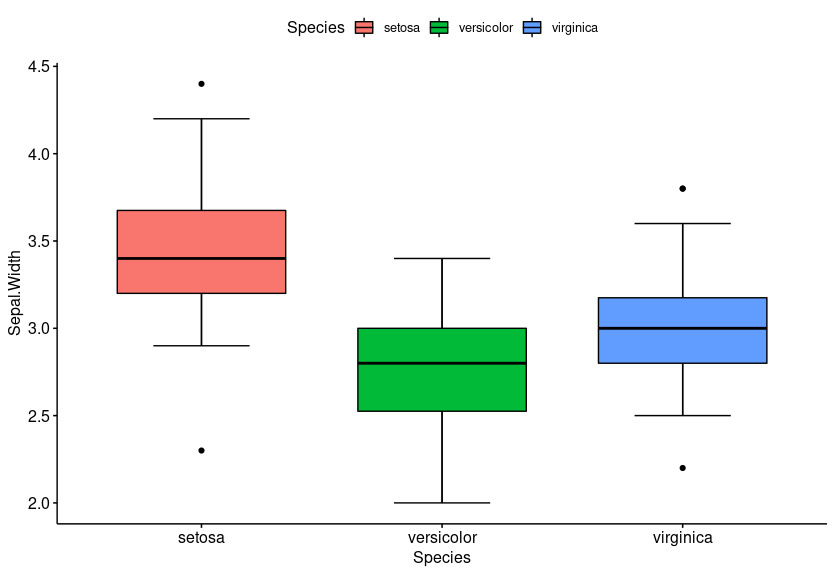
In the previous example using boxplots, we viewed the distribution of one variable Sepal.Width for every sample in the Iris dataset. What if we wanted to compare Sepal.Width amongst the 3 flower species?
We will use the library ggpubr to do this – the code is relatively intuitive. Bypassing the column Species to the x-axis, the plot will automatically divide our data according to the three flower species:
library(ggpubr)
ggboxplot(iris, x = "Species", y = "Sepal.Width", bxp.errorbar = TRUE)

For histograms and scatter plots, use the parameter facet.by to create faceted plots – one plot for each grouping variable in a panel.
gghistogram(iris, x = "Sepal.Width", y = "..density..", facet.by = "Species")

ggscatter(iris, x = "Petal.Length", y = "Petal.Width", facet.by = "Species")

Enhancing Plots
Adding colours to plots make groups instantly stand out. To do this in ggpubr, you will need to specify the fill parameter with the grouping variable. This will fill in your histogram bars/boxplots with a unique colour according to the number of unique groups in the variable (for the iris dataset this is ‘Setosa’, ‘Versicolor’ and ‘Virginica’).
gghistogram(iris, x = "Sepal.Width", y = "..density..", add_density = T, fill = "Species", add = "median")

ggboxplot(iris, x = "Species", y = "Sepal.Width", fill = "Species", bxp.errorbar = T)
Note:
For scatterplots, use color instead of fill.
ggscatter(iris, x = "Petal.Length", y = "Petal.Width", color = "Species")

EXERCISES
Copy and paste the dataframe below into your RStudio cloud workspace and carry out some analysis, using the examples above as a guide.
Create boxplots of gene expression for each of the 3 genes (IRX4, OCT4 and PAX6) in order to see if gene expression is higher or lower in tumour/normal.
Colour the box plots based on sample type by using the argument fill ="type".
Are there any genes which look particularly different between tumour and normal?
gene_expression <- data.frame(type=c("Tumour", "Tumour", "Tumour", "Tumour", "Tumour", "Normal", "Normal", "Normal", "Normal", "Normal"), IRX4 = c(11,13,14,15,11,2,1,3,6,2), OCT4 = c(10,13,8,8,9,4,3,2,6,7 ), PAX6 = c(1,3,7,4,2,10,9,12,5,3))